So after a lot of thought and further work on the book, I've come up with this revised blueprint.
I've decided that the book will be a little smaller than a typical children's illustration book at 8"x10" and will most likely have a quality that gives a nod to an older style of storybook. Ideally this would mean using some kind of leather for the cover and possibly debossing the title out of it but I realize that this will be a difficult process and may not work out quite as I imagine it.
In the event that the leather cover falls through I would most likely use some kind of paper that has an old-fashioned look to it and has a bit of texture and can still achieve that worn-out look I want. I would like to do a raw (exposed) binding with red thread or ribbon to carry through the theme of the book and add to the creepiness of it. As for paper, I think it will be necessary to use a fairly white stock in order to play up the contrast in the illustrations but I would definitely like to avoid anything too heavy or glossy to stay away from anything too modern.
Layouts of Spreads
I've also been working on possible layout options for the spreads. Here are a few of them;
Cover
Lastly, the cover is another thing I'm still undecided about as far as typeface goes. I definitely want to leave the cover fairly plain (either solid black or solid white - but most likely black) especially if I go with a leather option. The two typefaces are the same as the ones I'm debating with for the layouts (and most likely whichever one I choose for the layouts will be the one I use for the cover). Again, the Zombie Holocaust has a gittery pointy creepy edge to it that I like but A Lolita Scorned has a nod to decorative Renaissence caps from manuscripts and still has that creepy quality I want.
 |
| On the left is Lolita Scorned (with added blood drips) and on the right is Zombie Holocaust. Both have nice qualities that I like so I'm undecided. |
Illustrations
As of now I have most of the rough sketches for key points in the book done and have experimented with how I will ink them. Through the process of doing rough layouts of the text I've found that there will need to be spot illustrations on pages where the text runs shorter to avoid having a blank space below it. I think I will need to do rough layouts of the text for the entire book first and then figure out if more illustrations are needed or if what I've got is sufficient.
Here are some of the new roughs;
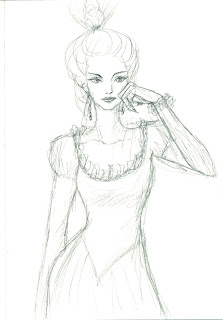
 |
| This is a frontal pose of the queen, possibly during one of her consultations with the magic mirror. |
 |
| This is the queen in her madness. I felt that it might be more dramatic to show her this way than in the original sketch I had posted earlier. |
 |
| This is also a sketch for the queen. She is more regal here so I might use this illustration at the beginning somewhere. |
 |
| This is one of the Redcaps. I like that they're all different but equally creepy in their own ways. |
 |
| Another Redcap. |
 |
| Redcap. |
 |
| I really like this guy for some reason (maybe it's the horned cap?). He looks the most demonic of all the Redcaps. |
 |
| This is Snow White (likely to be used for when she wakes up and meets the Redcaps). |
 |
| Snow White when the huntsman sees her in the woods. |
 |
| Snow White's death-sleep at the very end. She might look too peaceful here, though. |
Revised Timeline
Nov. 12
- text layouts finished, decide whether more illustrations are needed
Nov. 13-17
- working on final illustrations
Nov. 18-24
- illustrations completed
Nov. 25-30
- finalizing layouts, acquiring binding/printing materials and paper
Dec. 1
- finalize book
Dec. 2-6
- bind and complete book


No comments:
Post a Comment